PhysComp » Week 3: Observation
For my observation I choose a wall-mounted digital photo booth designed and (presumably?) manufactured by a company called Smilebooth.
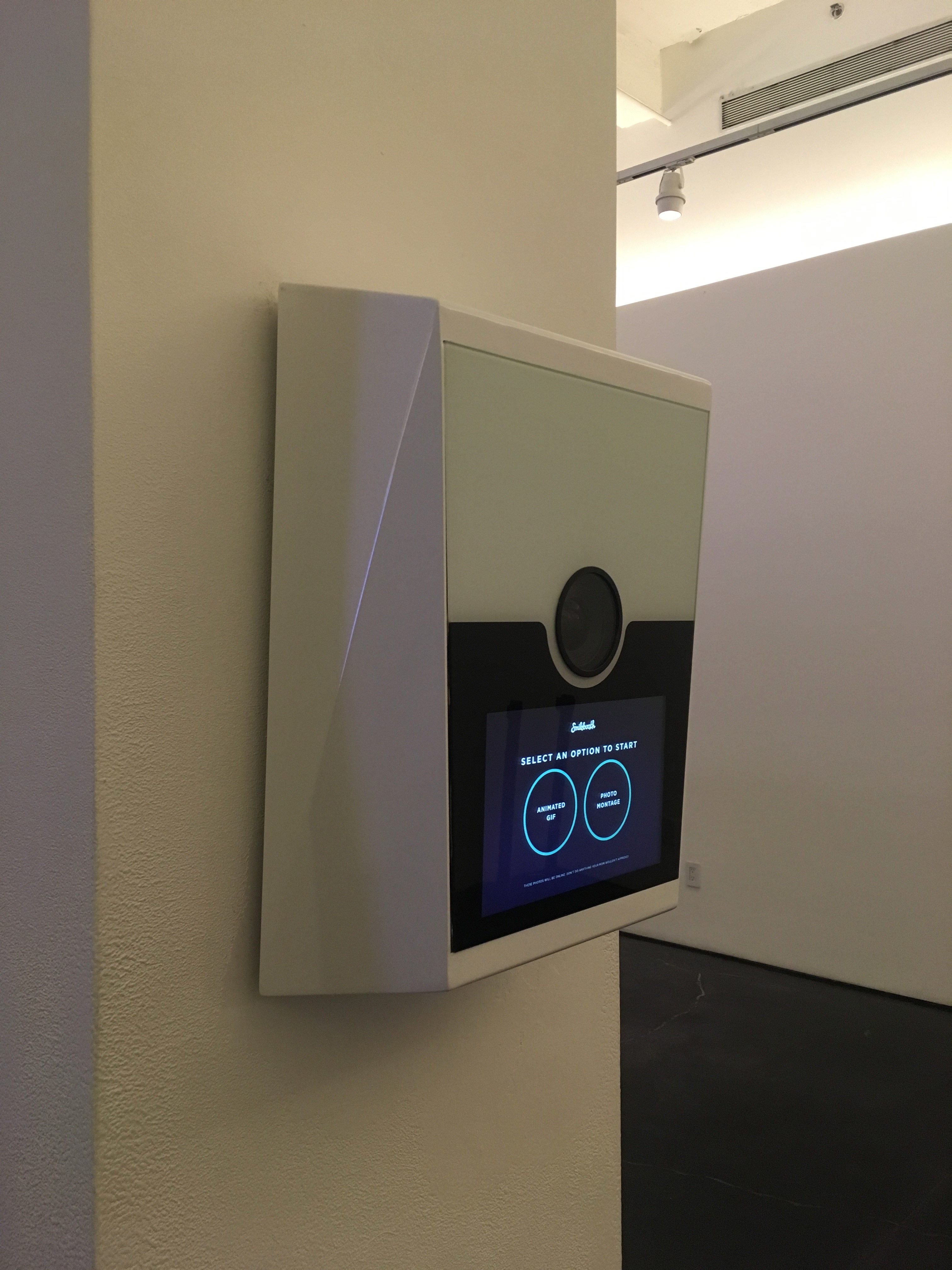
The photo booth is mounted in the lobby of Spring Studios, a slick commercial photography and events venue located in New York City’s stylish Tribeca neighborhood.
Upon further reflection, I realized the correlation between a self-serve photo booth and a venue that provides raw space for commercial photography shoots but at first glance it was in no way clear what purpose the object served. This, despite having used similar devices before.
The device is acutely unassuming. It’s design aesthetic is minimalist and modern (to whatever extent I understand those things) – bordering on industrial – and because the context in which it’s installed shares those same aesthetic principles, the photo booth blends into it’s surroundings almost to the point of disappearing. In no way does it draw attention to itself nor announce it’s purpose, which is a curious decision given it’s entire reason for being depends upon engaging users.
As if to illustrate that point, I spent the better part of an hour standing behind and off to one side waiting for people to engage with the photo booth and during that time the device only drew the attention of three individuals (separate from the individuals I filmed below).
It’s worth mentioning while yes, the device is located indoors in what might be considered a pseudo-public space, my observation took place during the Tribeca Television Festival during which there was was significant foot traffic.
I’m fairly certain in all cases it was the glow of the screen, not the intent / purpose of the device, that first drew their attention. That was certainly my experience.
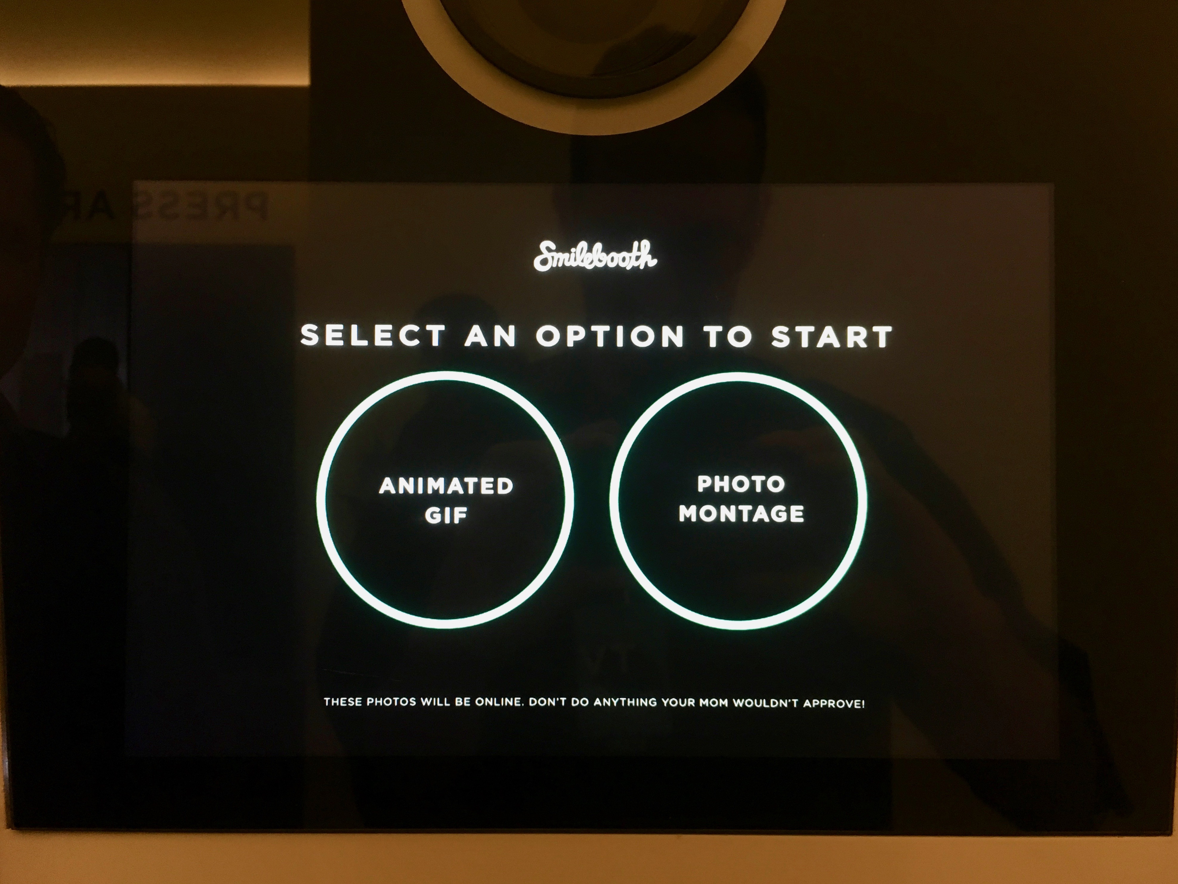
The user interacts with the photo booth via a touch screen and the interaction begins with a choice: Animated Gif or Photo Montage.
This is the user flow:
Patterns of use:
-
without exception, users selected the Animated Gif option first. I’m not sure whether this is because gifs are the more attractive proposition or because as reader / writers in this part of the world we tend to make selections starting from the left and moving right.
-
unquestionably the part of the interaction that took the longest was negotiating the on-screen keyboard while entering one’s email address.
-
excluding interactions that were abandoned before they were completed (or never begun), the entire interaction consistently took about one minute, give or take 5 to 10 seconds.
Recurring fails:
-
touch-selections failed to register at least once per engagement, often more than once, more often than not while attempting to make the same selection.
-
‘photo montage’ option took a single photo only, confusing users who expected multiple exposures
-
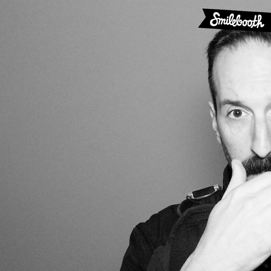
subjects were not framed properly, despite standing centered with respect to the camera lens (example below)
It’s difficult to observe the complex minutia of a given interaction, especially when it happens so quickly. I eventually succumbed to recording the interaction on video however because it was such a confined space, and because I was loath to be seen as intruding on someone’s privacy, I felt compelled to first ask permission.
A purist would no doubt say this effectively ‘contaminated’ the observation however in my own defense I only recruited individuals who 1.) were not previously aware of the photo booth’s presence and therefore 2.) had no prior experience with the interaction.
Subject 1
Highlights:
- touchscreen repeated failed to register selections
- was surprised / put off by the strobe flash
- later admitted was hesitant to provide email address
- later admitted was reluctant to engage with the device while in public
- later pointed out the interaction provided no indication how close or far to stand with respect to the device and therefor, as a consequence …
- the interaction is biased toward people of a certain height
Subject 2
Highlights:
- mistook the onscreen instructions “Look Here →” to mean ‘peer into this part of the device’ rather than ‘direct your gaze toward the lens’
- later admitted to providing a ‘junk email account’ when asked for an email address
- later admitted initially mistook the device for a wall-mounted hand dryer (like those you find in public restrooms)
Subject 3
Highlights:
- when the device malfunctioned was presented with the message “OOPS! I THINK YOU BROKE THE CAMERA.”
- later pointed out the onscreen instruction to “Go Crazy” (i.e., ‘be animated’) came after the screen directed the user to look elsewhere (“Look Here” → camera lens, away from the screen) and therefor missed the cue
TODO:
- Consider how the readings from Norman and Crawford reflect on what you see.